All use your exact brand colors, logo, fonts, and real (sharpened) content. Same DNA — three different moods. Direction C is the chosen one, evolved: new hero, more explanatory sections, real photography, and full SEO for Google AI search.
The evolved direction. Light and editorial with real photography, a new collage hero, and explanatory sections — fully tuned for Google AI search with rich structured data.
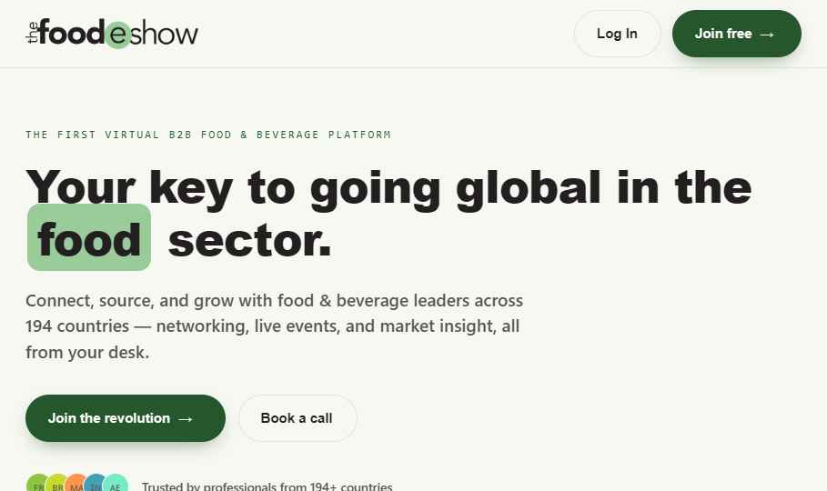
Light, fresh, and energetic. Green-forward and confident — a lively global marketplace that feels welcoming to buyers and sellers alike.
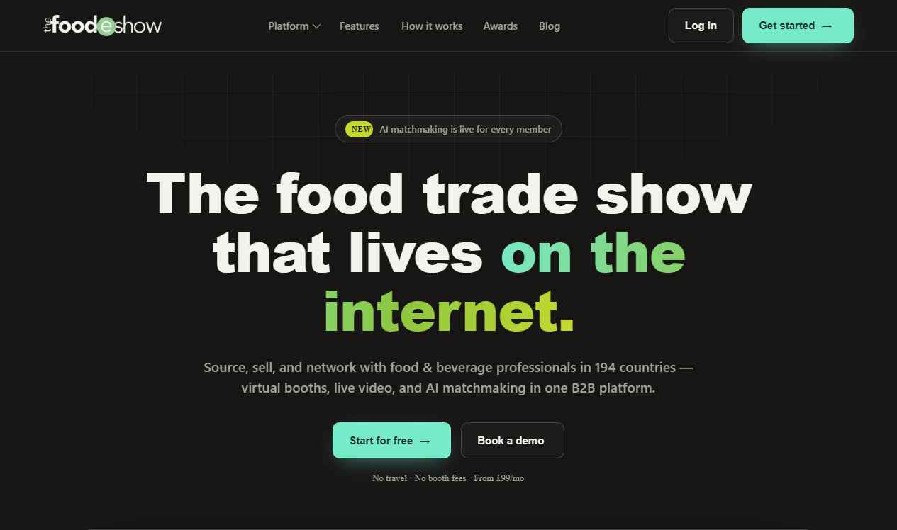
Dark, sleek, and techy. Mint and lime accents on charcoal — leans into the "first virtual platform" story with a modern SaaS feel.
What's next: pick a direction (or mix elements from both) and I'll build out the full page set — Attend, Showcase, Speak, Source, Sponsor, About, and Blog. Real photos and partner logos drop straight into the labeled placeholders.